
For eight parts we have built everything behind the glass — the domain, multi-tenant data, video, assessments, the event backbone, discovery, billing, and interoperability. None of it matters to a learner who can’t use the screen in front of them. The experience layer is where an LMS is actually won or lost, and it is the half that engineering teams most often treat as a thin veneer over the “real” system. That is a mistake twice over. First, because a backend nobody can navigate isn’t a product. And second, because for an LMS the front end carries obligations the back end never does: accessibility and internationalization are not nice-to-haves — they are legal requirements and market requirements. A university bound by the ADA, a government buyer under Section 508, a European customer under EN 301 549, a global learner base spanning right-to-left scripts and a dozen locales: these are gates, not polish. This part builds the learner-facing half as the production system it has to be — frontend architecture, a design system, the data layer, WCAG 2.2 accessibility, internationalization, performance, and the hardest client problem of all, working offline.
Scholr’s experience-layer crisis arrived as a letter, not an alert. A learner who relied on a screen reader could not complete a required course: a custom video player trapped keyboard focus, the quiz controls were unreachable without a mouse, and the course had no captions. The learner filed an ADA complaint, the university’s legal team got involved, and a feature that “worked” for most users became an existential compliance problem and a headline risk. Nobody had decided to exclude anyone; the team had simply never made accessibility a requirement, so it was never built, and “we’ll add it later” had quietly become “we shipped something unlawful.” The remediation — and the discipline that prevents the whole class of failure — is the spine of this part.
Frontend architecture: three surfaces, one system
An LMS is not one front end; it is at least three distinct surfaces with different users, different needs, and different rendering trade-offs. The learner app is the high-traffic, public-facing surface where SEO, first-load performance, and accessibility matter most. The instructor and authoring app is a rich, interactive tool used by a smaller, authenticated audience for long sessions — closer to a desktop application than a web page. The admin console is a data-dense internal surface where developer velocity matters more than first-paint speed. Treating these as one monolithic app forces a single set of trade-offs onto three problems that want different answers; treating them as wholly separate apps duplicates the design language and the API client three times. The right structure is a set of distinct applications over a shared foundation — a common design system and a common typed API client — so each surface optimizes for its own users while the look, the components, and the data access stay consistent.
The most consequential rendering decision is server-side rendering versus a single-page app, and for the learner surface it leans hard toward SSR. A framework like Next.js or Nuxt renders the page on the server so the learner — and, just as importantly, a search crawler — receives meaningful HTML on the first byte, then hydrates into an interactive app. For a public course catalog whose discoverability drives enrollment, that SEO and first-paint advantage is decisive. A pure client-side SPA ships a blank page and a large JavaScript bundle that must download and execute before anything appears, which is slower on the median device and invisible to crawlers. The instructor and admin surfaces, behind a login and indifferent to SEO, can lean more SPA-like, because their trade-off is interactivity over first-paint. The point is to match the rendering strategy to the surface rather than dogmatically picking one for the whole platform.

| Concern | SSR (Next/Nuxt) | SPA (client-only) |
|---|---|---|
| First paint / perceived speed | Fast — HTML on first byte | Slow — blank until JS loads |
| SEO / crawlability | Excellent | Poor without extra work |
| Interactivity after load | Full, after hydration | Full |
| Server cost / complexity | Higher (render servers) | Lower (static hosting) |
| Best surface | Learner app (public, SEO) | Instructor/admin (authed) |
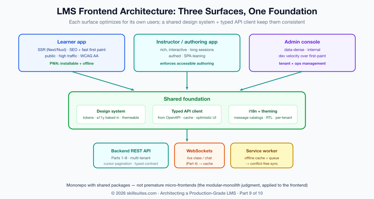
One architectural temptation worth resisting early is premature micro-frontends — splitting each surface into independently deployed fragments owned by different teams. At a large enough organization that boundary pays for itself, but for most LMS teams it imports significant build-and-runtime complexity (shared-dependency versioning, cross-fragment routing, duplicated payloads) long before the organizational scale that justifies it. The pragmatic structure is a monorepo with three applications and shared packages for the design system and API client — clean boundaries and shared code without the distributed-frontend tax. Reach for micro-frontends when independent team deployment becomes a real bottleneck, not before; it is the frontend echo of the modular-monolith-before-microservices judgment from Part 1.
A design system: consistency, theming, and white-label
Three surfaces built by different people drift apart unless something holds them together, and that something is a design system: a versioned component library (buttons, forms, modals, the video player, the quiz widget) built on design tokens — named values for color, spacing, typography, and motion that every component reads instead of hard-coding. Tokens are what make the system more than a folder of components; because a component references color.primary rather than a hex literal, the entire platform can be re-themed by swapping a token set. That capability is not cosmetic for a multi-tenant LMS: the tenants from Part 2 frequently want white-labeling — their own logo, colors, and sometimes typography — and a token-driven design system delivers per-tenant theming as a configuration change rather than a fork. The same architecture that isolates a tenant’s data can present that tenant its own brand.
A design system also happens to be the single highest-leverage place to bake in accessibility. If the library’s button, form field, modal, and menu are each built once to be keyboard-operable, correctly labeled, and focus-managed, then every screen assembled from those components inherits accessibility for free. Conversely, an accessibility defect in a base component is multiplied across every screen that uses it — which is exactly how Scholr’s keyboard trap reached a required course. Consider what “accessible by construction” means for something as ordinary as a toggle: it is a real <button> (keyboard-focusable and operable for free), it exposes its state to assistive technology, and it never relies on color alone:
<!-- accessible by construction: real button, state exposed, label present -->
<button
  type="button"
  role="switch"
  aria-checked={enabled}              {/* screen readers announce on/off */}
  aria-label="Mark lesson complete"   {/* a name even with no visible text */}
  onClick={toggle}
  onKeyDown={handleKeyboard}>
  <span className="track" />          {/* state shown by position + icon, not color alone */}
</button>
Build that once, and every “mark complete” toggle, every settings switch, every filter across all three surfaces is accessible. Build it as a <div onClick> instead — invisible to the keyboard and the screen reader — and you have manufactured a barrier at industrial scale. The design system is where accessibility is won or lost wholesale, which is why it is the right place to spend the effort.
The data layer: a typed client, caching, and optimistic UI
Between the components and the API from the earlier parts sits the data layer, and getting it right is what makes an app feel fast and stay correct. The foundation is a typed API client — generated from the backend’s OpenAPI schema so the front end and back end can never silently disagree about a field’s name or shape; a type error at build time is infinitely cheaper than a bug in production. On top of that sits a caching and server-state library (TanStack Query, SWR, or similar) that deduplicates requests, caches responses, and revalidates in the background, so a learner moving between screens sees instant data instead of a spinner on every navigation.
Two patterns make the difference between an app that feels responsive and one that feels sluggish. Optimistic UI applies a change locally the instant the learner acts — marking a lesson complete, submitting an answer — and reconciles with the server response in the background, rolling back only on failure; the learner never waits on a round-trip for an action that almost always succeeds. And cursor-based pagination (the kind the backend exposed in earlier parts) keeps long lists fast as they grow. The real-time surfaces from Part 4 plug in here too: the live-class chat and presence arrive over the WebSocket connection and update the cached state, so the same data layer serves both request-response and pushed updates. The throughline is that the data layer is where correctness (typed, consistent) and perceived speed (cached, optimistic) are won together.
Accessibility (WCAG 2.2 AA): the legal floor, built in
Now the heart of the part, and of Scholr’s crisis. Web accessibility is governed by WCAG 2.2 (Web Content Accessibility Guidelines), and conformance to Level AA is the practical and legal target — the standard that the ADA is interpreted against in US courts, that Section 508 mandates for federal buyers, and that EN 301 549 requires across the EU. For an LMS, whose buyers are disproportionately universities and governments, AA conformance is not a differentiator; it is the price of being allowed to sell at all, and the cost of failing it is lawsuits and lost deals, not just an awkward audit.
WCAG is organized around four principles — content must be Perceivable, Operable, Understandable, and Robust (POUR) — and the concrete requirements that matter most for an LMS follow directly. Keyboard operability: every interactive element must be reachable and usable with the keyboard alone, with no keyboard traps (the exact bug that trapped Scholr’s screen-reader user in the video player) and a visible focus indicator at every step. Semantic structure and ARIA: use real headings, lists, and landmarks so a screen reader can navigate the page, adding ARIA roles and labels only where native HTML semantics fall short — and never as a substitute for them. Focus management: when a modal opens, focus moves into it and is trapped within it until it closes, then returns to where it was; when content updates dynamically, the change is announced. Media: every video needs synchronized captions and, ideally, a transcript — the captions the Part 3 video pipeline must carry are an accessibility requirement, not a feature. Color and contrast: text must meet a 4.5:1 contrast ratio, and color must never be the only way information is conveyed (a red “incorrect” needs a word or icon too, for color-blind learners).
| WCAG level | What it covers | Use it as |
|---|---|---|
| A | Bare-minimum barriers removed | Necessary but insufficient |
| AA (the target) | Contrast, keyboard, captions, focus, labels | The legal/market floor for an LMS |
| AAA | The strictest criteria (e.g. 7:1 contrast) | Aspire selectively; rarely required wholesale |
The discipline that makes this real rather than aspirational is twofold: automate what you can and test what you can’t. Automated tools (axe, Lighthouse) catch a meaningful fraction of issues in CI and should gate every build — but they catch perhaps a third of WCAG criteria. The rest require manual testing: navigating the whole flow with only a keyboard, and actually using the product with a screen reader (NVDA, JAWS, or VoiceOver). An LMS team that has never heard its own course played through a screen reader does not know whether its course is usable, and “we ran Lighthouse” is not a defense in a complaint. Accessibility is a practice, embedded in the design system and the test suite, not a one-time audit.
| Accessibility check | Catches | Misses | When |
|---|---|---|---|
| Automated (axe, Lighthouse) | Contrast, missing alt/labels, ARIA misuse | ~⅔ of criteria — logic, focus order, meaning | Every CI build (gate) |
| Keyboard-only pass | Traps, unreachable controls, focus order | Screen-reader semantics | Every release |
| Screen-reader test (NVDA/VoiceOver) | Is it actually usable + understandable? | — | Key flows, each release |
| User testing (disabled users) | Real-world barriers tools never model | — | Periodically; high-stakes flows |
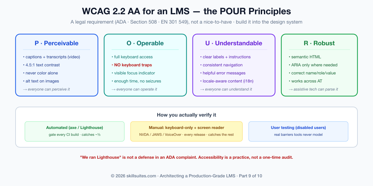
One responsibility unique to an LMS deserves a callout: the platform’s accessibility depends not only on its components but on the content authors create in it. A perfectly accessible course player is undermined by a video with no captions or an image with no alt text — and those come from authors, not engineers. So the authoring app from Part 8 must make the accessible choice the easy one and, for required courses, the enforced one: prompt for alt text on every image, require or auto-generate captions for every video, warn on low-contrast color choices, and surface an accessibility checklist before publish. Pushing accessibility upstream into authoring is how a platform stays conformant at scale, because it stops inaccessible content from being created in the first place rather than discovering it in an audit. Accessibility is a shared responsibility between the product and the people who fill it with courses, and the tooling is what makes that partnership work.
Internationalization and localization: speaking every learner’s language
A global learner base means the interface must adapt to language, script, and locale — and the time to build for that is before you have content in twelve languages, not after. Internationalization (i18n) is the architecture that makes localization possible: no user-facing string is ever hard-coded; every one is a key resolved at runtime against a message catalog for the active locale, with proper handling of pluralization (which varies wildly across languages — some have six plural forms) and interpolation. A framework (react-i18next, FormatJS, vue-i18n) handles the machinery, and a message-extraction step pulls the keys out for translators. Localization (l10n) is then filling those catalogs and adapting locale-specific formats: dates, numbers, and currencies rendered the way each locale expects (the Intl APIs do this natively), so a learner in Germany sees 14.06.2026 and one in the US sees 6/14/2026 from the same code.
The requirement that catches teams off guard, because it cannot be retrofitted cheaply, is right-to-left (RTL) support for Arabic, Hebrew, Persian, and Urdu. RTL is not “translate the text”; it mirrors the entire layout — navigation flips to the right, progress bars fill leftward, icons that imply direction reverse. Building this in from the start means using logical CSS properties (margin-inline-start instead of margin-left, padding-inline-end instead of padding-right) so the layout mirrors automatically when the document direction flips, rather than auditing thousands of hard-coded left/right values later. A platform that designs LTR-only bakes a Western assumption into its CSS that becomes enormously expensive to remove. One more distinction worth naming: translating the UI (a bounded set of strings you control) is a different problem from translating course content (open-ended, authored, often the customer’s responsibility) — the platform must support both, but they are handled by different pipelines.
| i18n concern | The trap | The right approach |
|---|---|---|
| UI strings | Hard-coded in components | Keys resolved from per-locale catalogs |
| Dates / numbers | Manual formatting | Locale-aware Intl APIs |
| RTL languages | Hard-coded left/right CSS | Logical properties; mirror on dir flip |
| Plurals | “1 item(s)” | Framework plural rules per language |
Performance: Core Web Vitals, and why it’s an accessibility issue too
Performance on the front end is measured by Core Web Vitals — Largest Contentful Paint (how fast the main content appears), Interaction to Next Paint (how responsive the page feels to input), and Cumulative Layout Shift (how much the page janks around as it loads). These are not vanity metrics: they are a Google ranking factor (so they affect the catalog’s discoverability) and, more importantly, they are a retention factor — a learner on a slow connection or a modest phone abandons a sluggish course. The techniques are well established: code-splitting so each route ships only the JavaScript it needs rather than one giant bundle; lazy-loading images and especially video so the heavy Part 3 media loads only when needed; serving right-sized, modern image formats; and budgeting the bundle so a feature can’t silently bloat the critical path.
| Core Web Vital | Measures | “Good” target | Lever |
|---|---|---|---|
| LCP (Largest Contentful Paint) | Time to main content | < 2.5s | SSR, image sizing, lazy media |
| INP (Interaction to Next Paint) | Input responsiveness | < 200ms | Code-split; avoid long main-thread tasks |
| CLS (Cumulative Layout Shift) | Visual stability | < 0.1 | Reserve space for media/ads/fonts |
The framing that should change how a team prioritizes this: performance is an accessibility issue. The learners most affected by a slow, heavy front end are precisely those on older devices, low-end phones, and limited or metered data connections — disproportionately learners in lower-income contexts and emerging markets, exactly the populations an education platform should be reaching. A 6-megabyte bundle is not just a Core Web Vitals problem; it is an exclusion of everyone whose device or data plan can’t afford it. Treating performance as a tax you pay for inclusion, rather than a number you optimize for SEO, is what aligns it with the platform’s actual mission.
Mobile and offline: a PWA, and the distributed problem on the client
Learning does not only happen at a desk on fast Wi-Fi; it happens on a commute, on a plane, in a building with no signal. Supporting that does not necessarily mean building native iOS and Android apps — a Progressive Web App gets most of the way there from the web codebase: installable to the home screen, capable of running offline through a service worker that caches the app shell and content, and able to download a course for offline use. A PWA is the pragmatic default; you reach for true native apps when you need capabilities the web can’t reach (deep OS integration, certain hardware APIs, app-store distribution as a requirement) or a level of polish a particular market demands. For most LMSs, a well-built PWA covers the mobile and offline need at a fraction of the cost of maintaining three codebases.
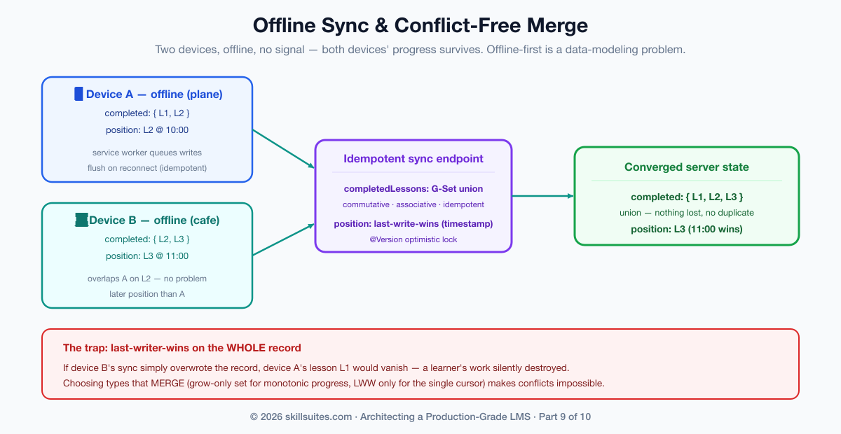
And here is where the experience layer reveals its own distributed-systems problem — the one this series has been training you to recognize. A learner downloads a course, makes progress offline (perhaps on two devices), and reconnects: now there is offline state to sync and conflicts to resolve against the server. Last-writer-wins on the whole record is the naive answer, and it is wrong — it silently throws away one device’s work. The right answer is to choose data structures that merge. Scholr models this on the server with conflict-free rules: the set of completed lessons is a grow-only set (a G-Set CRDT) merged by union, which is commutative, associative, and idempotent — two devices that each completed different lessons both win, and re-syncing the same batch changes nothing — while the single “where was I” cursor is a last-write-wins register resolved by timestamp, the right rule for a genuinely single value. Completion is monotonic (you never un-complete a lesson), so a grow-only set conflicts by construction never; only the cursor needs arbitration:
public void merge(SyncBatch batch) {
    completedLessons.addAll(batch.completedLessons());           // G-Set union — conflict-free
    if (batch.lastPositionAt() != null
        && (lastPositionAt == null || batch.lastPositionAt().isAfter(lastPositionAt))) {
        lastPositionLesson = batch.lastPositionLesson();         // last-write-wins by timestamp
        lastPositionAt = batch.lastPositionAt();
    }
}
The sync endpoint that wraps this is idempotent — a client can safely retry a sync it isn’t sure landed — which is the same discipline that protected enrollment, submission, events, and payments throughout the series, now applied to a flaky mobile connection. The lesson generalizes: offline-first is a data-modeling problem before it is a UI problem. Pick types that converge, and the sync is conflict-free; pick types that don’t, and you spend forever writing conflict-resolution dialogs that lose data anyway.
On the client side, the service worker is what makes any of this possible, and its caching strategy is a deliberate choice per resource type. The app shell (the HTML, CSS, and JavaScript) is cached cache-first so the app launches instantly and offline. API data is typically network-first with a cache fallback, so a connected learner gets fresh data but a disconnected one still sees the last-known state. Downloaded course media is cached explicitly when the learner taps “download for offline,” with a clear size indication and the ability to remove it — storage is finite and a course full of video is large. And writes made offline are queued (the Background Sync API, or a simple durable queue) and flushed to the idempotent sync endpoint on reconnect. Each of these is a small decision, but together they are the difference between a PWA that genuinely works on a plane and one that shows a dinosaur the moment the signal drops.
| PWA | Native app | |
|---|---|---|
| Codebase | One (the web app) | Separate per platform |
| Offline / installable | Yes (service worker) | Yes |
| Reach / cost | Broad, low cost | Higher cost, per-store |
| Deep OS / hardware | Limited | Full |
| Reach for it when | Default for most LMSs | You need native-only capability |
The war story, resolved — and what we’d do differently
Scholr’s ADA complaint came down to three concrete, fixable failures, all in shared components: a video player that trapped keyboard focus, quiz controls that couldn’t be operated without a mouse, and videos with no captions. The remediation fixed each at the source — the player and the quiz widget in the design system were rebuilt to be fully keyboard-operable with proper focus management, captions became a required, validated part of the Part 3 video pipeline, and an automated accessibility check plus a manual screen-reader pass entered the release process. Because the fixes landed in the shared components, every screen that used them became conformant at once. The complaint was resolved, the deal was saved, and — the real win — the product became usable by learners it had been silently excluding.
What would we do differently? We would have made accessibility a definition-of-done from the first component, not a remediation after a complaint — building it into the design system is cheap; retrofitting it across a built-out app is expensive and, until you do, unlawful. We would have internationalized from the start, using logical CSS properties and externalized strings even while we shipped in one language, because retrofitting RTL and message extraction across a mature codebase is brutal. And we would have designed the offline sync around conflict-free data types up front, rather than discovering on reconnect that last-writer-wins was eating learners’ progress. The thread, as ever in this series: decide the hard property — accessibility, localizability, conflict-free merge — at the start, encode it in the foundation, and every screen built on that foundation inherits it.
Get the code and run it
The experience layer is largely a front-end concern, but its hardest distributed problem — offline sync with conflict resolution — lives on the server, and that is what’s in the companion repository, evolving the same codebase the series has built since Part 1. Each part has its own branch frozen at that lesson’s checkpoint, and main always holds the latest cumulative code.
# this part's exact code:
git clone https://github.com/muasif80/tutorial-lms-platform.git
cd tutorial-lms-platform
git checkout part-9

# the latest cumulative build is always on main:
git checkout main
Verify it the way the build does — the conflict-free multi-device merge, the last-write-wins cursor, idempotent re-sync, and tenant isolation all run under one command:
mvn verify # green = G-Set union + last-write-wins + idempotent sync all holdWhere each idea in this article lives in the code:
- Conflict-free offline merge (G-Set + LWW) —
sync/domain/CourseSyncState.java(themergemethod) andsync/domain/SyncBatch.java. - The idempotent sync endpoint —
sync/SyncService.java+web/SyncController.java. - Tenant isolation + RLS for offline state —
db/migration/V6__sync.sql. - The proof —
OfflineSyncTest.javaasserts multi-device union, last-write-wins ordering, idempotent re-sync, and tenant isolation.
Frequently asked questions
SSR or SPA for an LMS frontend?
Match the rendering strategy to the surface. Use server-side rendering (Next.js, Nuxt) for the public learner app, where SEO and fast first paint drive enrollment and a crawler must see real HTML. The instructor and admin surfaces sit behind a login and don’t need SEO, so they can lean more toward a client-side SPA optimized for rich interactivity. Building all three over a shared design system and a shared typed API client keeps them consistent while each optimizes for its own users — you don’t have to pick one strategy for the whole platform.
What does WCAG 2.2 AA actually require, and is it legally mandatory?
WCAG 2.2 Level AA is the practical legal floor for an LMS: it is the standard the ADA is interpreted against in the US, that Section 508 mandates for federal buyers, and that EN 301 549 requires in the EU — so for university and government customers it is effectively mandatory. Concretely AA requires full keyboard operability with no keyboard traps and visible focus, semantic structure with appropriate ARIA, proper focus management for modals and dynamic updates, captions and transcripts for video, a 4.5:1 text contrast ratio, and never using color as the only way to convey information. Automated tools catch only about a third of this; the rest needs manual keyboard and screen-reader testing.
How do I support offline course access without sync conflicts?
Treat offline-first as a data-modeling problem, not just a UI feature. Build the app as a PWA with a service worker that caches the app shell and downloaded course content, and design the sync around data structures that merge cleanly. Model monotonic progress (completed lessons) as a grow-only set merged by union, which is conflict-free and idempotent so two devices and retries all converge without losing work; resolve genuinely single-valued state (the last position) with last-write-wins by timestamp. Make the sync endpoint idempotent so a client can safely retry. Last-writer-wins on the whole record is the trap — it silently discards a device’s progress.
How do I internationalize, including right-to-left languages?
Externalize every user-facing string into per-locale message catalogs resolved at runtime (react-i18next, FormatJS), handle plurals with the framework’s rules, and format dates, numbers, and currencies with the locale-aware Intl APIs rather than by hand. For right-to-left languages (Arabic, Hebrew, Persian, Urdu), use logical CSS properties (margin-inline-start rather than margin-left) so the entire layout mirrors automatically when the document direction flips — building this in from the start is cheap, whereas retrofitting RTL across a codebase full of hard-coded left/right values is extremely expensive.
Conclusion
The experience layer is where an LMS meets the human being it exists to serve, and where “works for most people” is revealed as the failure it is. We structured the front end as three surfaces over a shared design system and typed data layer; made accessibility a built-in property of that system so WCAG 2.2 AA conformance — a legal and market requirement, not a nicety — is inherited by every screen; internationalized for a global, multi-script audience including right-to-left; treated performance as the inclusion issue it is; and solved offline learning by modeling sync around conflict-free data types so a learner’s progress survives a plane, a dead zone, and two devices. Scholr’s exclusion of the learners it should have served first is now designed out.
The full, tested implementation of the offline-sync engine — the conflict-free merge and the idempotent endpoint, verified by a build that proves them — is on the part-9 branch of the companion repository. ⭐ Star it to follow the build. Next, in Part 10, the capstone, we make the whole platform production-grade: security, testing, CI/CD, scaling, SRE, and cost — and we show exactly how to deploy and run the entire system, end to end.
